
Creating a blog site with Eleventy
Over the course of a software engineering career, one comes across many interesting problems. It makes sense to document them and their respective solutions because it gives you the chance to reflect on what you have learned. Blogging is a natural way to do this, with the additional benefit of allowing you to showcase your work. The following are my experiences creating a blog site with the Eleventy static site generator.
Back To Basics
Originally, I wanted to start this site to showcase my learning around neural networks by creating a digit recognizer application. However, once the core application was done, I started to blog about my experiences creating it. I needed a way to organize the content around that blog, including web page styles and images. I knew there were platforms like github.io that would help me get up and running quickly, but I was also interested in doing my own web development.
Rather than go down the route of platforms, frameworks, or tools, I decided that I wanted to get back to basics with HTML, JavaScript, and CSS. I am really glad I did because there have been a lot of changes with those three in the last few years, and even in the last few months, that have made front-end development much easier.
For example, there are new Pointer events for JavaScript, which makes coding for mouse events from a desktop or laptop, and touch events from mobile so much easier to handle. I didn't have to worry about handling different events in different ways on disparate platforms like iOS and Android. There was one set of events that worked on all platforms.
Another notable change was CSS nesting. I could now nest CSS rules within other rules, which was something I was only able to do with tools like Sass. Gone are the days of looking back and forth between the HTML document and the CSS document to figure out which CSS rules apply to which HTML classes. You can have logical groupings of components in the HTML code that have their own defined styles without resorting to complex CSS selectors.
After creating the blog post around the digit recognizer, all that was left to do was deploy it to a hosting platform. AWS was the natural option for me since I have the most experience with it. Also, it is very inexpensive, costing me almost nothing per month to host with the AWS S3 service behind AWS CloudFront. I recommend this route for anyone needing simple static website hosting.
Static Site Generation With Eleventy
I finally had my first blog post, but when you are ready to make an additional post, you probably want to have some common structure for each one of them. This is where a static site generator (SSG) comes in. An SSG will help you organize your content in such a way that you can reuse common parts of your site over and over again so that you can concentrate on making content instead of making sure all of your web pages on your site have the same look and feel.
There are a lot of SSGs out in the wild. A lot of them use different template languages, like Markdown, to generate content. I wanted something that was simple and easy to set up, and did not get in the way of using simple HTML tags. After some research, I settled on Eleventy, which is a newer minimalist static site generator. It works with multiple template languages and is easy to set up and use quickly. I chose Nunjucks with plain HTML as the template language since a lot of Eleventy examples I have seen use them. The learning curve with Eleventy is not bad, but I feel like the documentation could use some work. The following site will help you create a minimalistic blog site quickly and is titled Itsiest, Bitsiest Eleventy Tutorial.
Layouts
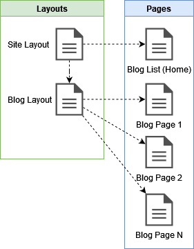
The fundamental building block of any static site generator is the layout. The layout abstracts away common components in a web page so that they can be used multiple times. Individual pages can then reference these layouts and get the same look and feel. I chose to create two layouts, one that applies to the entire site and the other that applies to only blog pages. Layouts can also reference other layouts, as is the case with the blog layout referencing the site layout. This way, every page on the site gets the same navigation bar with the same icons, the same font, and the same HTML meta tags helpful for SEO provided by the site layout. In turn, all pages that are blog posts will get the same font styles, line heights, and font sizes in the blog layout.
Eleventy Structure
Eleventy comes with its own predefined folder structure that helps you organize your files. You can change the defaults in the eleventy.js config file and come up with additional folders to help you organize your website.
    dir: {
      input: "src",
      includes: "_includes",
      data: "_data",
      output: "_site"
    }
I tried different folder structures and came to the following after some trial and error. One thing that kept bothering me when I was starting out was that I was trying to create a fancy, deeply nested folder structure, thinking that I was being clever with my organization. However, having a deep folder structure, and trying to figure out the semantics of that structure when revisiting the code base at a later time can be confusing, so I decided to avoid any deep nesting.
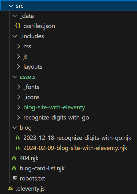
The src directory is the root directory where all website
content resides. It contains an _includes directory, which
contains anything that can be included on a particular HTML page, like CSS,
JavaScript, and the layouts mentioned earlier, minus visual media like
fonts, images, and video, which are contained in a separate
assets folder. The assets folder is copied over
with every build of the website.
You may be wondering why the _includes folder and the
assets folder are separate. The reason is that the
_includes folder is only used during the build process of the
website, while the assets folder is copied over to the build
output folder, whose contents are referenced by generated HTML pages. As an
example, the layouts mentioned previously are in the
_includes folder and are used to build HTML pages. Hopefully
this makes more sense when I explain how the CSS and JavaScript, which are
also in the _includes folder, are incorporated into the
website.
There is also a special _data directory that contains
structured data that the different templates can reference. In my case, I am
referencing the blog page specific CSS styles used on the website. I will
explain this in greater detail a bit later.
Finally, there is the blog folder, which contains the different
blog entries as templates. Each entry contains content specific to that blog
post, plus references to a layout and website assets. Each of these
templates is built into individual HTML pages, which are generated as
blog/blog-post-name/index.html in the output directory. This gives
the required URL resource structure for individual blog entries, such as
www.yourdomain.com/blog/blog-post-name.
Eleventy Template Data
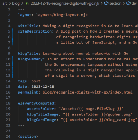
Every Eleventy template supports the concept of front matter data, which allows you to create data to be used in your templates. There are some special keys that can be used in the front matter data that are unique to Eleventy, some of which are described here. Note that this is not a comprehensive list.
- layout: describes the layout template that this page template should use
- tags: describes the grouping that this page belongs to
- date: describes the canonical date when the page was created or last modified
- permalink: describes how this page should be represented in the build output
In addition to tags, Eleventy also provides special variables for each template, which can be referenced in a variety of contexts. For example, there is the page variable, which allows access to the file name and other metadata about the page. In the above screenshot, the page variable is being used to get the file name of the blog post so that a path to the assets folder can be constructed. This way, each blog post can reference the correct set of images and other media for that blog post.
What is great about front matter data is that it can be referenced outside
of the current template. For example, using the screenshot above, the
siteTitle and siteDescription are referenced in
the site layout's head section, where the title and description
of an HTML page belong.
    <head>
      ...
      <meta name="description" content="{{ siteDescription }}"/>
      <title>
        {{ siteTitle }}
      </title>
      ...
    </head>
Similarly, the blog layout references blogTitle,
blogTitleImage, and blogSummary in the header of
every blog page.
    <header class="header">
      <div class="headline">
        <img alt="" src="{{ blogTitleImage }}" />
        <h1>{{ blogTitle }}</h1>
      </div>
      <span class="byline">
          <em>by {{ author }},
              <time datetime="{{ page.date | formatYYYYMMDD }}">
                {{ page.date | formatMMDDYYYY }}
              </time>
          </em>
      </span>
      <div style="clear: both"></div>
      <p class="summary">
        {{ blogSummary }}
      </p>
    </header>
Eleventy Collections
Earlier, I mentioned that tags can group related pages together. This is important because this is how collections work in Eleventy by allowing you to iterate over pages that have the same tag. The home page of this website iterates over all the blog posts so that a viewer can scroll through them and find the one that they want to read. Each blog post is encapsulated in a card that shows the blog title, author, date of creation, the site description for that blog post, and an image that relates to the blog post. When page collections are iterated over, we have access to all front matter data defined for that page. In the case of blog posts, we have all the relevant information we need to build out a card.
    {% for post in collections.post | reverse %}
     <a class="card" href="{{ post.page.url }}">
         <div class="card-content">
             <h1 class="card-title">{{ post.data.blogTitle }}</h1>
             <div>
                 <em>
                     by {{ post.data.author }},
                     <time datetime="{{post.date | formatYYYYMMDD }}">
                         {{ post.date | formatMMDDYYYY }}
                     </time>
                 </em>
             </div>
             <img alt="" class="card-image" src="{{ post.data.blogCardImage }}" />
             <p class="card-summary">{{ post.data.siteDescription }}</p>
         </div>
     </a>
    {% endfor %}
CSS and JavaScript
Templates work great for breaking up the HTML structure of a document into separate logical pieces. However, both CSS and JavaScript are not so straightforward in this regard. They both have constraints on how they get loaded and placed on an HTML page. There is also the question of loading the right CSS and JavaScript at the right time based on what the user is currently viewing.
JavaScript is not used much on most blogging websites since most content on
those sites remains static. In my case, so far, I use it with the
digit recognizer component to
send a request to a web service and modify content on HTML canvases based on
the response. I figured I could get away with placing minified JavaScript
between script tags in the body of the document right after the
digit recognizer HTML elements. This allows the elements to be loaded in the
DOM so that the JavaScript that references them has access to the elements
that it needs. In fact, it is common practice to load JavaScript right
before the ending body tag on an HTML document since all other
HTML elements should have finished loading.
So placing JavaScript is pretty easy, but this is not the case for CSS.
Originally, I went ahead and did something similar with the CSS by loading
it between style tags right where the styles were needed. This
is actually not a very good idea. Even though my website worked, there was a
very noticeable shifting of content back and forth when pages were first
rendered. This is commonly referred to as
cumulative layout shift (CLS), and this Google
page
has a very good explanation of the problem.
Another idea I had was to load all styles for every page, even though some of the styles would never be used. This did not sit well with me since I knew I was downloading additional KBs for every page view, which was unnecessary. Even another solution could be to use front matter data that references the correct CSS file to use for a particular page. References to the file would then be made in the site layout. This would work but may not be scalable when more than one CSS file exists for a blog post. In that case, the amount of front matter data that needed to be referenced just for CSS files could be quite confusing.
So I needed to load the right CSS styles at the right time and in the right
place. In the case of a web page, that would be within the context of the
head tag. However, the head tag lives in the site
layout, which is referenced by the blog layout, which in turn is referenced
by individual blog pages. For a particular blog page, the styles for the
individual blog page itself, the styles for all blogs in general, and the
styles for the entire site would all have to be loaded into the site layout
at the same time. On the home page, which lists the blog post summaries in
individual cards, only the styles for the site and blog cards are required.
The solution I came up with was to leverage the _data folder,
which I mentioned earlier. Within that folder is a file called
additionalFiles.json, which describes the individual CSS files
needed for a particular page that gets loaded (if any). With this data and
some conditional code in the site layout, I am able to load the styles that
I want.
      {% set css %}

        {# Always include #}
        {% include "css/styles-site.css" %}

        {# Include based on which page type is shown #}
        {% if page.url === '/' %}
          {% include "css/styles-blog-card.css" %}
        {% elif '/blog/' in page.url %}
          {% include "css/styles-blog.css" %}
        {% endif %}

        {# Include additional styles if defined for a particular page #}
        {% for entry in additionalFiles %}
          {% if page.fileSlug === entry.pageName %}
            {% for file in entry.css %}
              {% include "css/" + file %}
            {% endfor %}
          {% endif %}
        {% endfor %}

      {% endset %}

      <head>
        <style>
        {{ css | cssmin | safe }}
        </style>
      </head>
The above code loads the styles that are common for every page on the site, like the look and feel of the navigation icons. In addition, if the user is on the homepage, the styles for the blog cards get loaded; if the user is on a blog page, the styles for blog pages get loaded. If a particular blog post has even more styles, like in the case of the digit recognizer, those CSS files will be referenced in the aforementioned additionalFiles.json.
All these files are loaded into
one variable called css, whose content is placed within the
head tag of the document after being minified. I liked the
solution of bringing in page specific styles via
additionalFiles.json so much that I decided to go back and do the
same thing with the JavaScript, only this time placing the minified
JavaScript code between script tags right before the closing
body tag.